
Basic Introduction
PIC Technology is an over-the-counter company that sells professional measuring instruments. The types and quantities of instruments sold are quite considerable, and the customers are all over the government and private units at home and abroad.
PIC instrument side tech with fly. Creative Interactive has a long-term cooperation, this official website design project, executed in 2014, is with Fei. One of several projects of creative interactive cooperation.
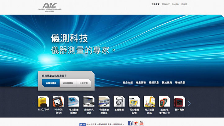
The design team uses a variety of friendly designs to increase the speed of users searching for products, speed up browsing, and ultimately increase the chance of placing an order.
Some design details, such as the upper right corner of the object, will have a beveled surface and thin borders, which are also the details that we increase the sense of technology and fineness.
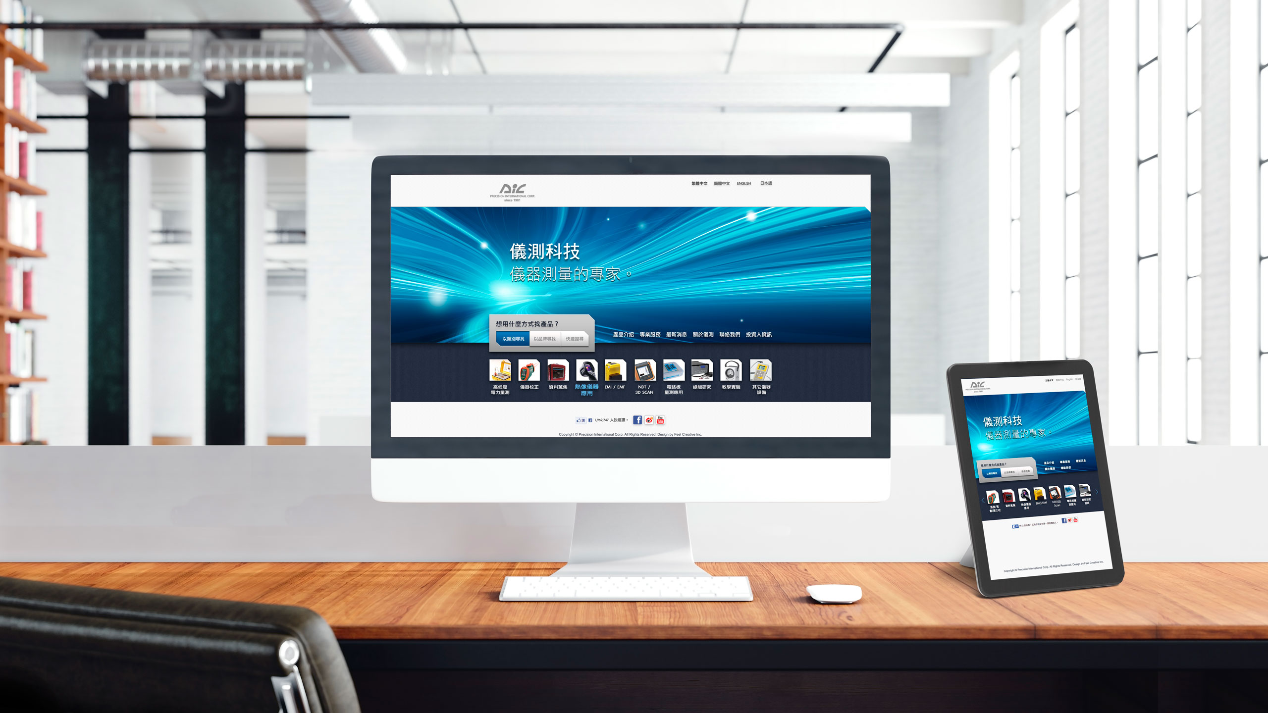
The whole site is developed in the way of RWD responsive web design, which makes the website more inclusive and fully supports desktop computers, notebook computers, tablet computers, and smart phones.
Concept of Design
Use a variety of friendly designs to increase the speed of users searching for products, speed up browsing, and ultimately increase the chance of placing an order
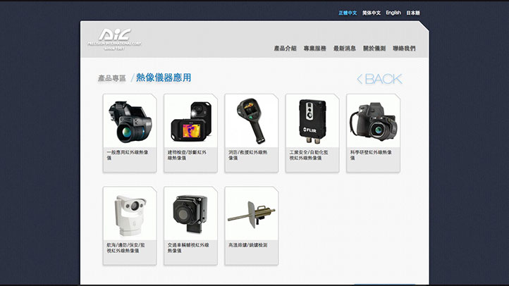
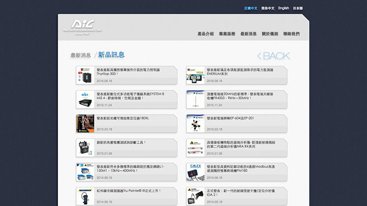
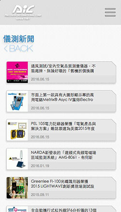
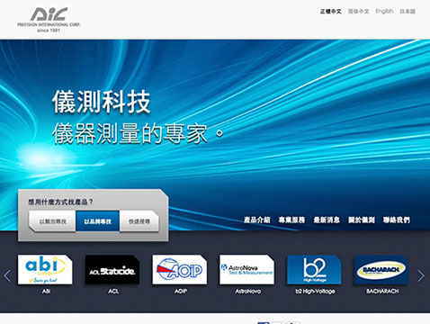
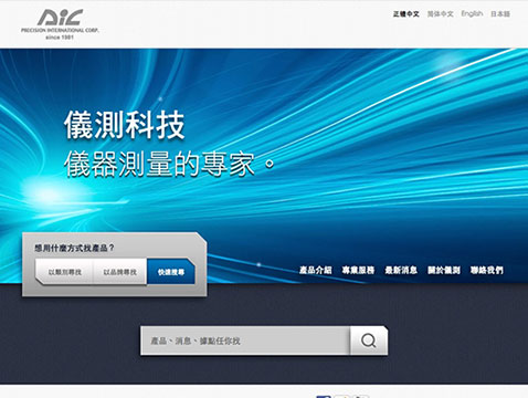
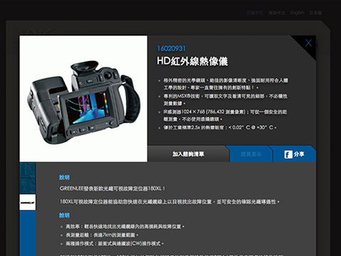
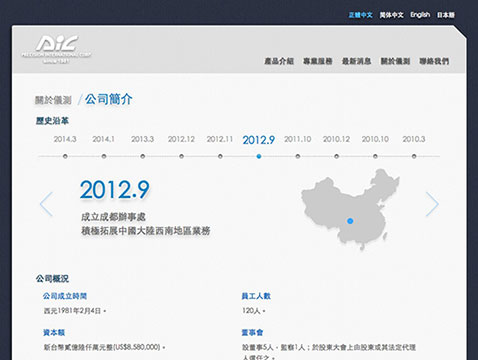
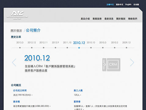
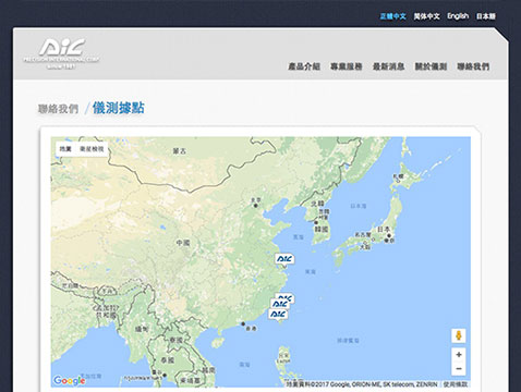
There are a huge number of products to be displayed, how to enable users to quickly find the products and information they need, and quickly establish contact channels is an important topic in website development.
The second is to be able to support the most devices, so that whether users access the website with laptops or mobile phones, the friendliness must be ahead of the industry, and the transaction rate will naturally increase.
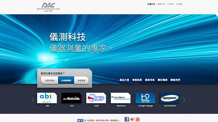
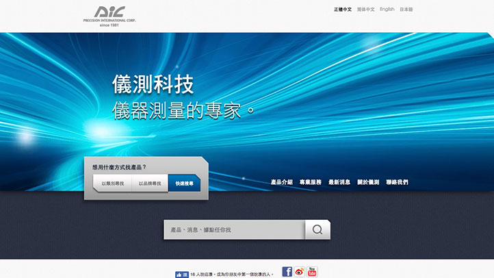
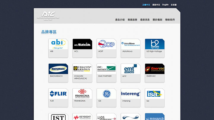
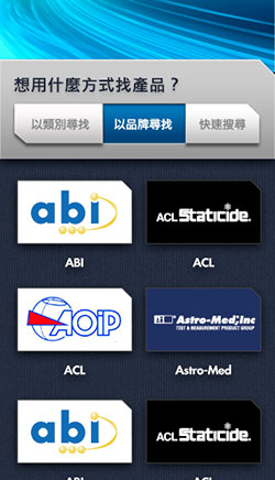
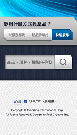
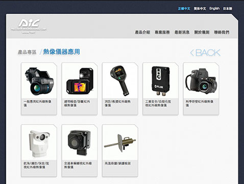
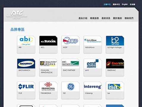
Therefore, the design team designed three methods on the homepage. Users can use product categories, brands or direct search to quickly find the information they need.
Secondly, the entire website is designed in the way of RWD Responsive Web Design. This design specification allows desktops, mobile phones, and tablets to see the optimized screen and screen configuration in the same web page.
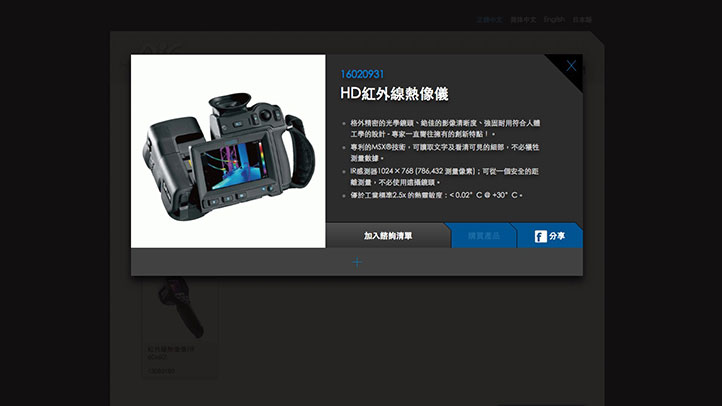
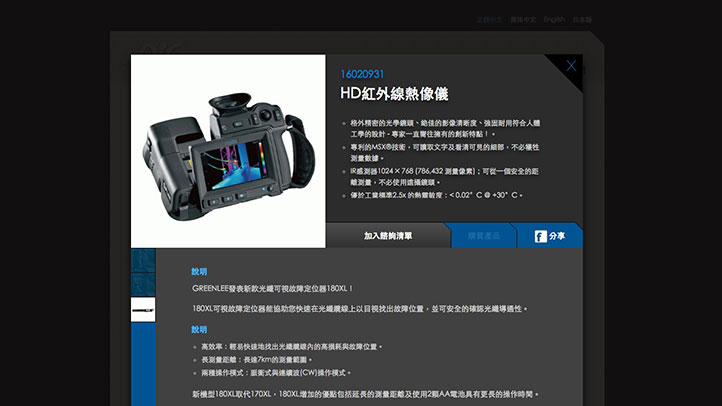
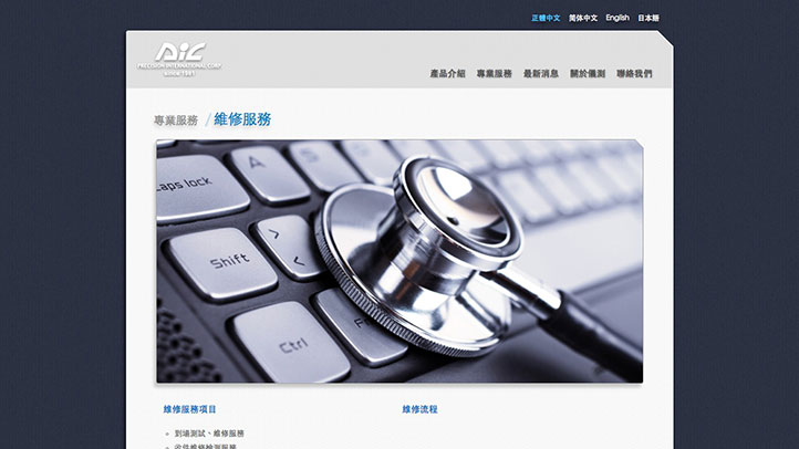
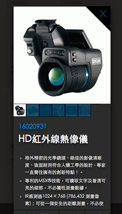
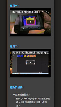
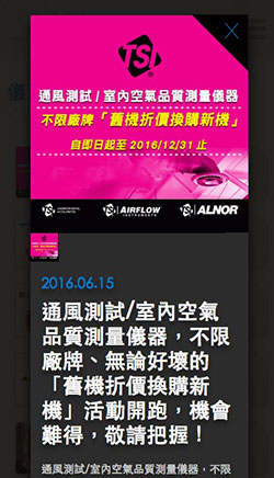
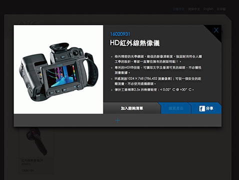
In terms of interactive design, the design team also designed the product content page or news page with the highest usage rate to be opened directly on the page, and only the key graphics and texts in the upper section are displayed to improve the display speed. If the user is interested, then expand all the graphics, text, audio and video content downwards to increase the speed of browsing the web, and ultimately increase the chance of placing an order.
Using HTML5 related technologies, when browsing the website, the content display and screen design can be simultaneously improved.
* PIC Technology All Rights Reserved
Color Scheme
Use steady dark blue as the main color of the website, and light gray as the auxiliary color, with two image textures to increase texture and depth
Use dark blue as the main color tone of the website to increase the sense of stability, and use light gray as the auxiliary color.
The shading of the wavy curve and the shading of the blue cloth texture are also widely used in the website, so that the screen design can have some texture and depth without being too cold.
There are also some subtle designs, such as the upper right corner of the object on the right, which will have a beveled surface and thin borders, which are also details that we increase the sense of technology and fineness.
R201 G201 B201
#C9C9C9
R242 G242 B242
#F2F2F2
R39 G118 B182
#2776B6
R49 G59 B87
#313B57
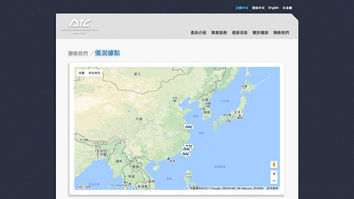
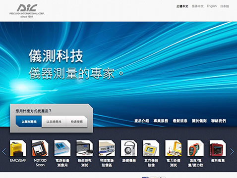
Desktop version
Browsing this website with a desktop computer or notebook computer, you can feel a dynamic and momentum just by entering the homepage
However, the entire website implements RWD responsive web design (Responsive Web Design) design, so that the display area and readable range of all web pages become larger and wider than ordinary websites. Can bring better browsing quality.
Support PC / Mac desktop computer, notebook computer, browsers above Chrome, Safari, Firefox and IE9.
* PIC Technology All Rights Reserved
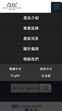
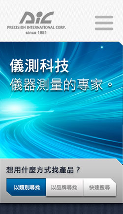
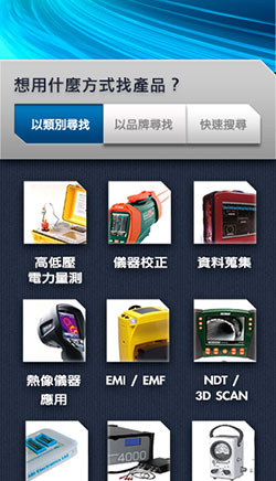
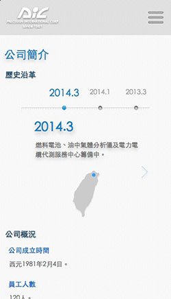
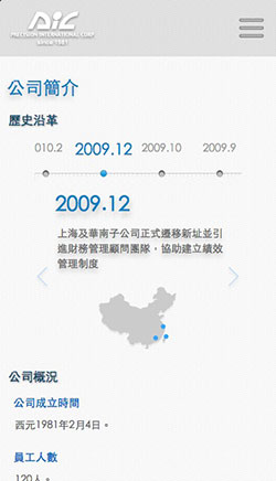
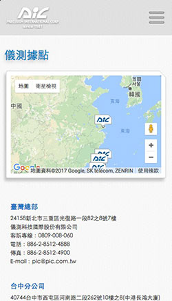
Smartphone Version
Redesign the vertical screen for mobile phones, and browse the website smoothly with one hand
Once the smartphone is connected to the website, it will directly see the search-first homepage setting, helping mobile phone users with smaller screens to quickly find the information they need.
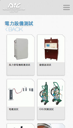
In view of the vertical display mode of smartphones, the design team also redesigned the operation interface, using clear menus, so that mobile phone users can quickly switch pages or units to find the information they need.
Support iOS / Android / Windows smartphones.
* PIC Technology All Rights Reserved
Tablet Version
Streamlined and optimized version for smooth browsing on tablets
Browsing this website with a tablet computer can also get an excellent picture presentation due to the rigorous planning of the RWD responsive web design. All complex parallax elements have been optimized so that the tablet can also achieve perfect display in a smaller screen Balanced, easy browsing of the site.
Support iOS / Android / Windows tablets.
* PIC Technology All Rights Reserved
Related cases

Related cases
Uncle Liao's Health House

Related cases
Roadshow FUN movie guide download landing page
 EN
EN  TW
TW