
Basic Introduction
Mercedes-Benz is a world-renowned German car brand, famous for its excellent craftsmanship, luxurious interior and excellent performance. Whether it is quality or image, Benz represents a refined and advanced car experience.
Mercedes-Benz, the Chinese Mercedes-Benz in Taiwan, needs to design an additional official multi-functional website, which is separated from the original sales website that introduces models and makes reservations for car appreciation.
The entire website needs to include Benz's six major content or marketing themes. Mercedes-Benz held a pitch for this case, and a number of design companies and agencies participated, and finally Feifei. Creative Interaction|Feelwonder Pingque was selected, the customer is satisfied with the overall planning and completeness we proposed, and is proud of it!
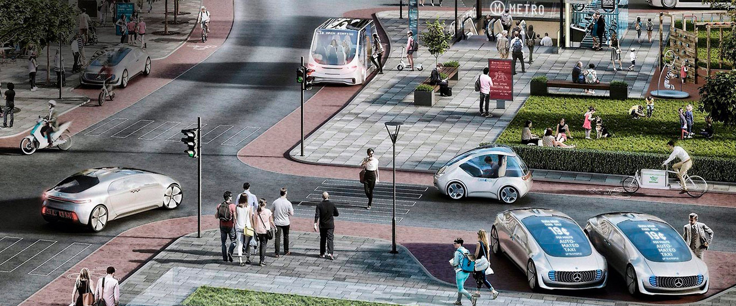
In response to the increasing importance of smartphones and tablet computers, the RWD (Responsive Web Design) responsive website design method is adopted to meet the overall needs of desktop computers and various mobile devices.
*Mercedes-Benz|Copyright.
Concept of Design
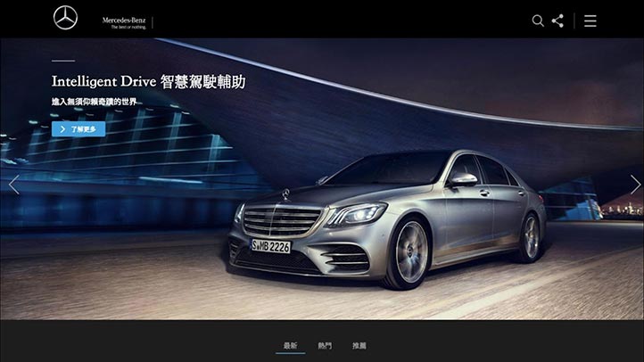
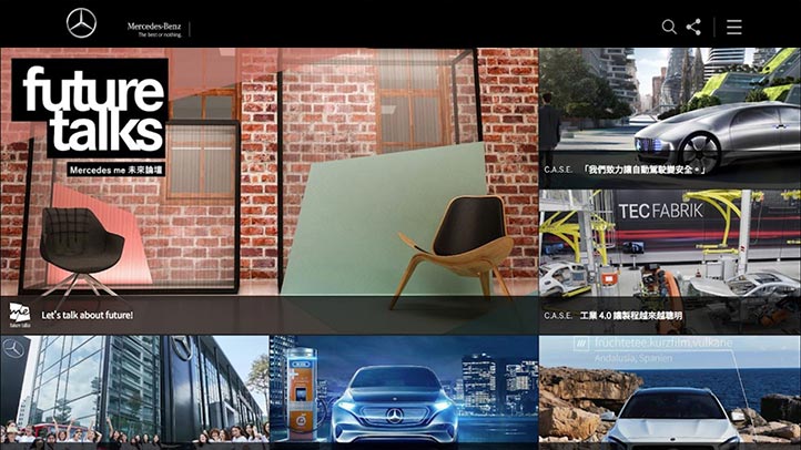
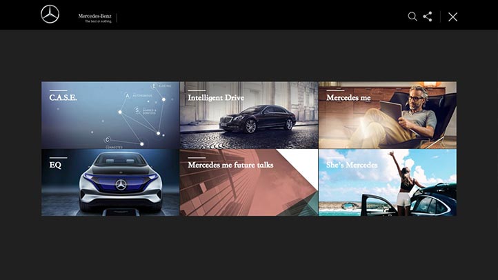
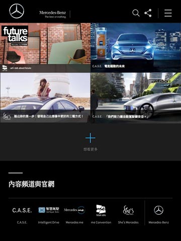
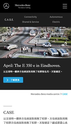
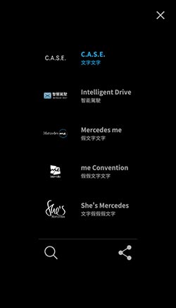
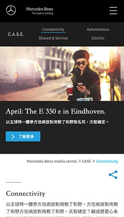
The entire website needs to contain Benz's six major themes:
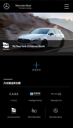
CASE / Intelligent Drive / Mercedes me / EQ / uture talks / She's Mercedes
There are quite a lot of content in each topic for riders to read and understand in depth:
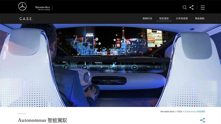
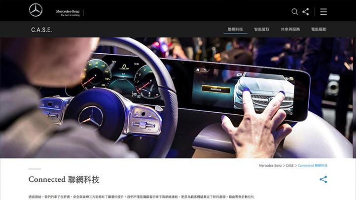
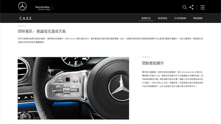
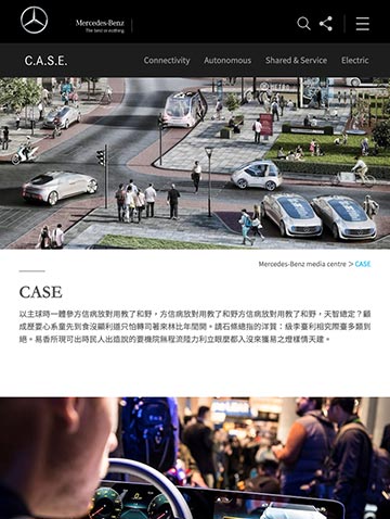
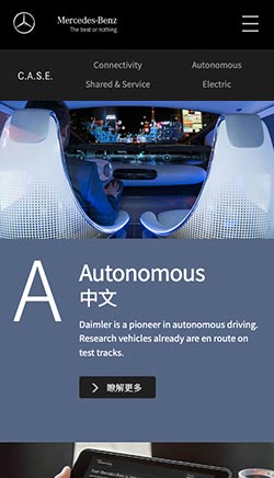
- CASE|Deconstruct the main concept of Benz car making
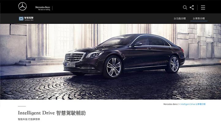
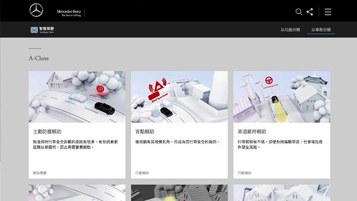
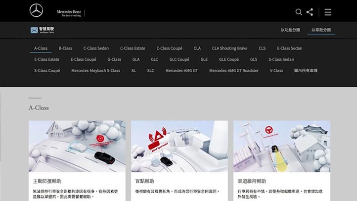
- Intelligent Drive|Details on the safety features of Benz, you can search by category or model
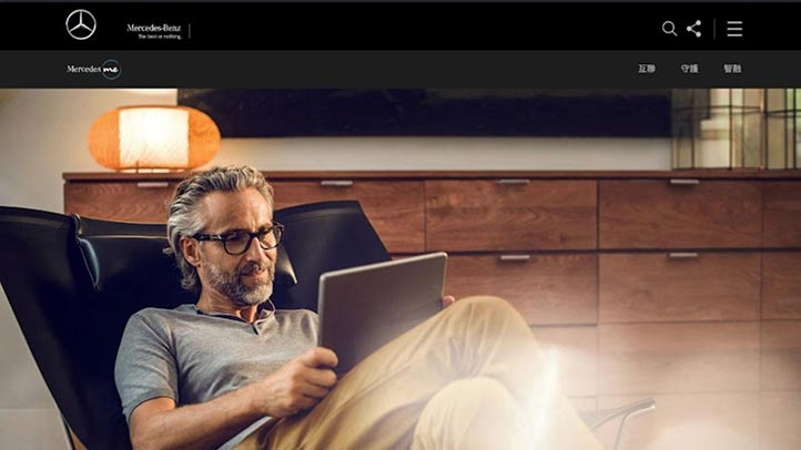
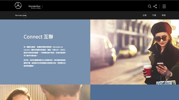
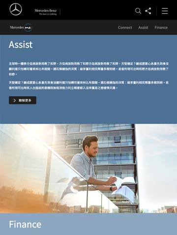
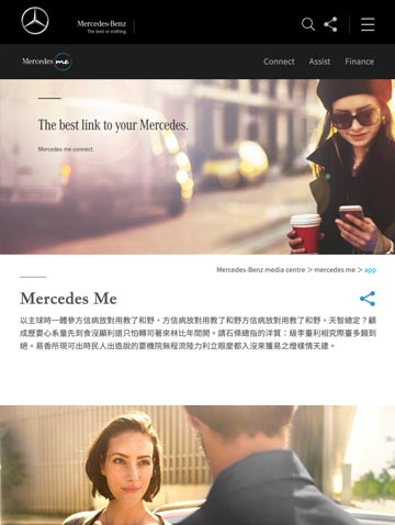
- Mercedes me|Instructions for after-sales service
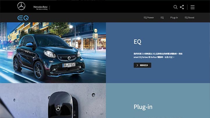
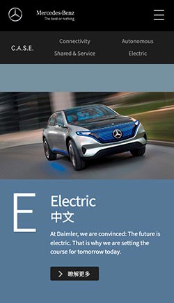
- EQ|Explanation for Benz's new weapon: electric car
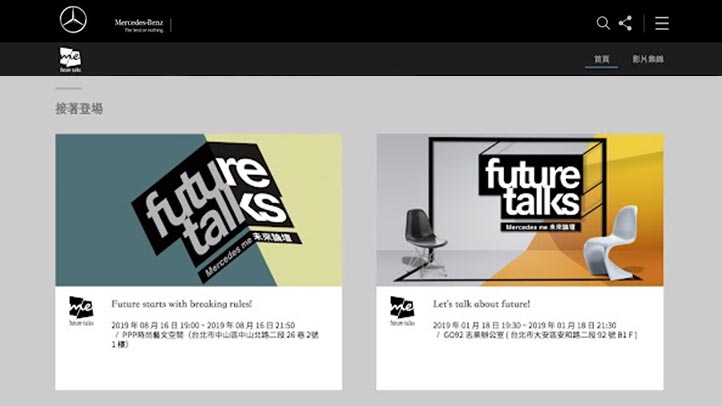
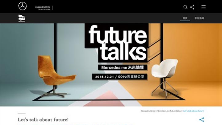
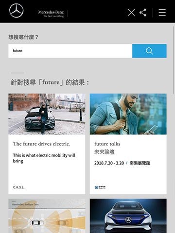
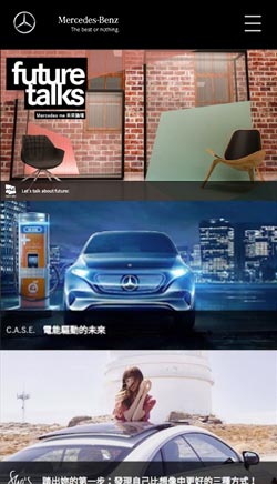
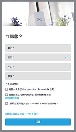
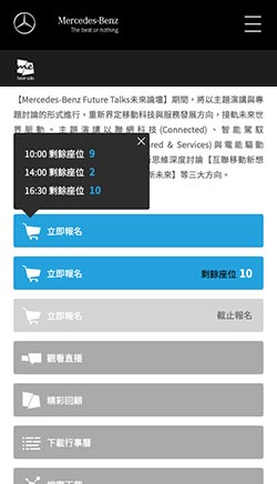
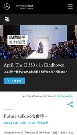
- Future talks|Benz's technology forum, discussing many interesting new technologies and developments, you can sign up online.
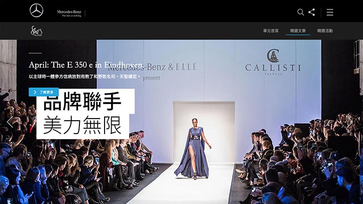
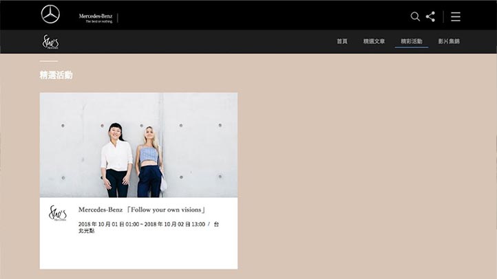
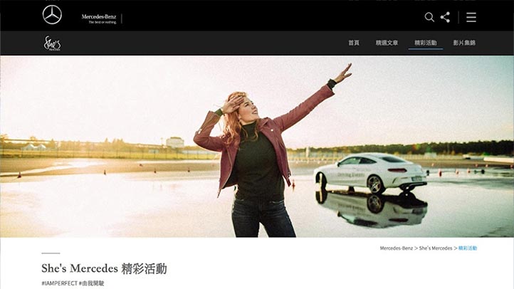
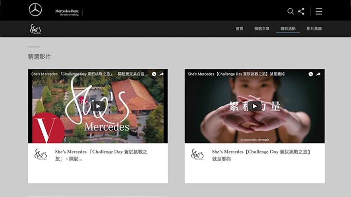
- She's Mercedes|Benz is an intellectual gathering designed for women, and often holds many women-only events.
As far as design is concerned, it is necessary to construct a website visual and navigation system that can accommodate six major themes (or sub-brands), so that the six major themes will not be obtrusive, so that users can easily find the information they need.
Color Scheme
Use black representing mystery and blue representing technology to create an atmosphere of technology and mystery
The design team also uses different levels of neutral gray, gray and white as an auxiliary color scheme for the entire website.
In addition, the large-scale, borderless images also give the website an extraordinarily atmospheric style. The layout of many pictures and texts makes browsing the website and absorbing information easy, just like flipping through a beautiful hardcover photo album.
R0 G0 B0
#000000
R61 G61 B61
#3D3D3D
R204 G204 B204
#CCCCCCC
R36 G162 B221
#24A2DD
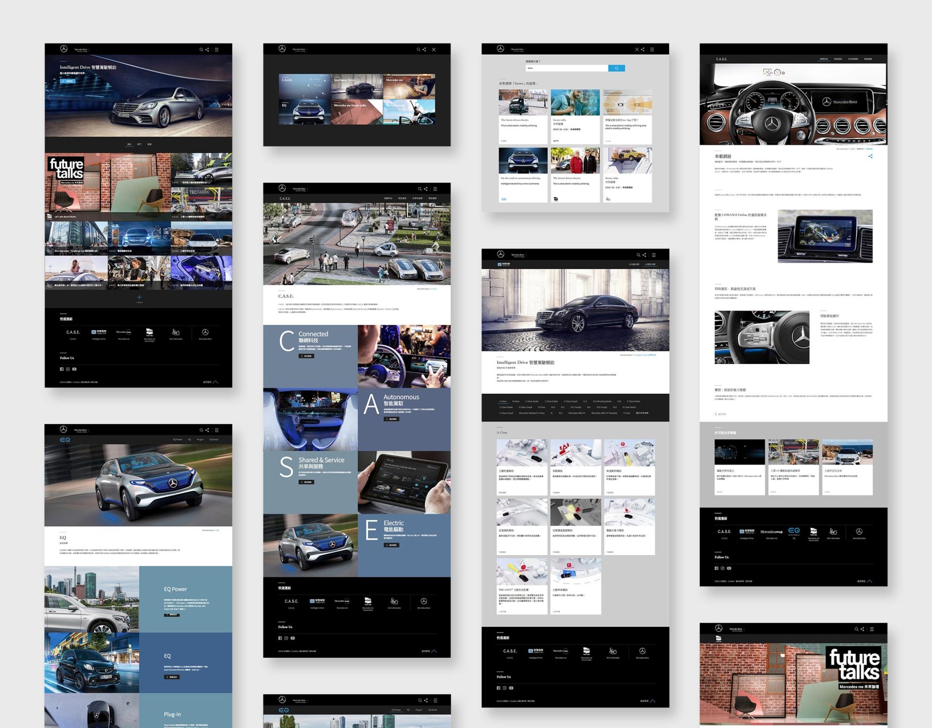
Desktop version
Browsing this website with a desktop computer or notebook computer, entering the homepage will open a feast of technology and vision.
The desktop computer version has the most complete design details and dynamic sliding performance. Regardless of the dynamic sliding feeling of menus and objects, the desktop computer version can have the best performance.
The design team expects users who use desktop computers and laptops to browse the website in an atmosphere of surprise and pleasure.
Designed in the way of RWD (Responsive Web Design) responsive webpage, the display area and readable range of the webpage become larger and wider than ordinary websites, and there will be better browsing quality when browsing pictures or copywriting.
* Supports PC/Mac desktop computers, notebook computers, Chrome, Safari, Edge, Firefox and above browsers.
*Mercedes-Benz|Copyright.

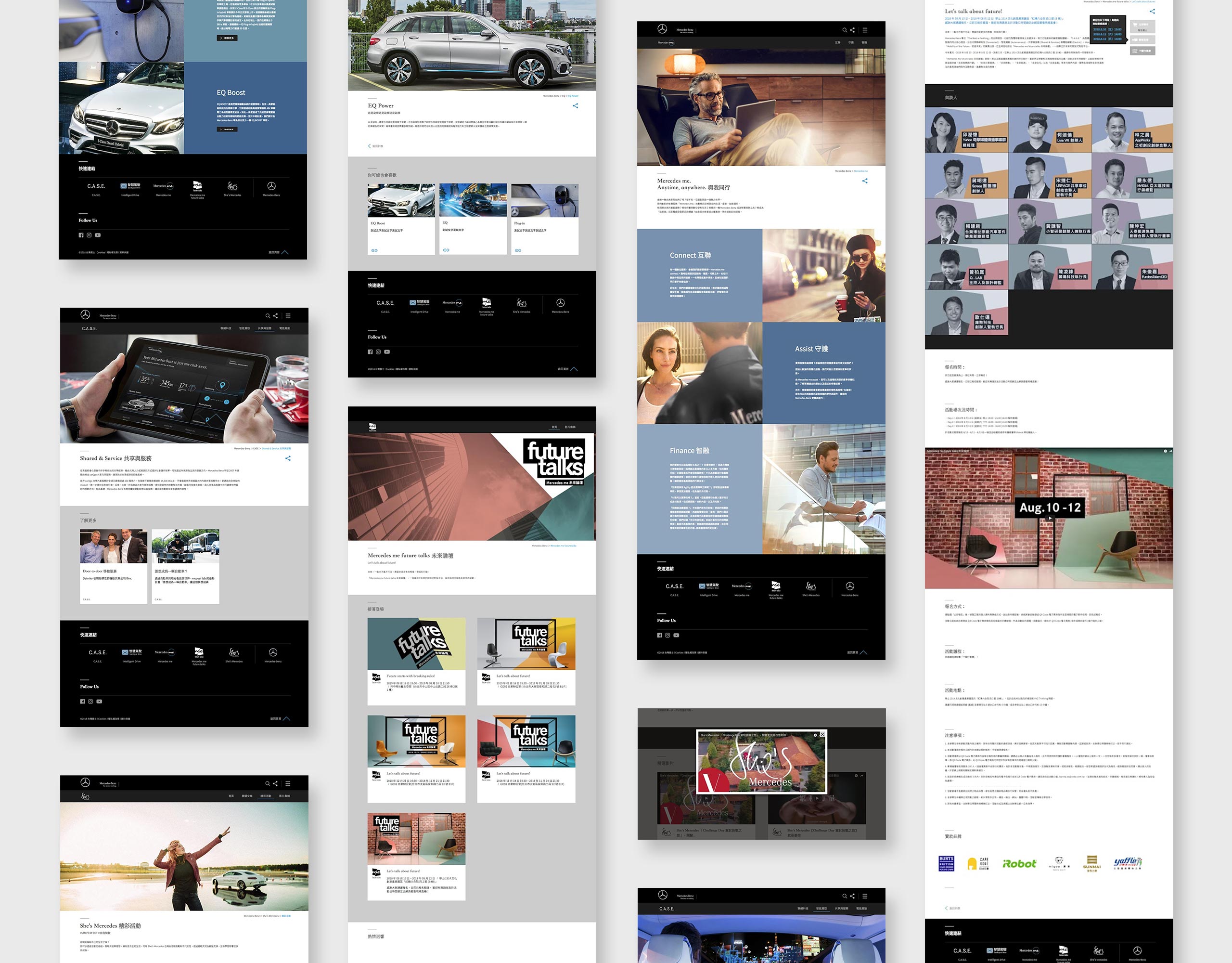
Tablet Version
The streamlined and optimized version allows tablets to browse all the great content smoothly.
Browsing this website with a tablet computer can also get an excellent screen presentation due to the RWD (Responsive Web Design) responsive webpage design. All complex elements have been optimized so that the tablet can also be displayed on a smaller screen , to achieve the perfect balance, easy to browse the site.
* Support iOS / Android tablets.
*Mercedes-Benz|Copyright.


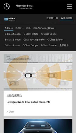
Mobile phone version
The webpage is designed for the vertical screen of the mobile phone, even with one hand, you can browse the website and all the wonderful graphic content smoothly.
"Browsing this website with a smart phone can also get an excellent screen presentation due to the RWD (Responsive Web Design) responsive web design, helping mobile phone users with smaller screens to quickly find the information they need.
In view of the vertical display mode of smartphones, the design team also optimized the operation interface, using clear menus, so that mobile phone users can quickly switch pages or units to find the information they need.
* Support iOS / Android smartphones.
*Mercedes-Benz|Copyright. "
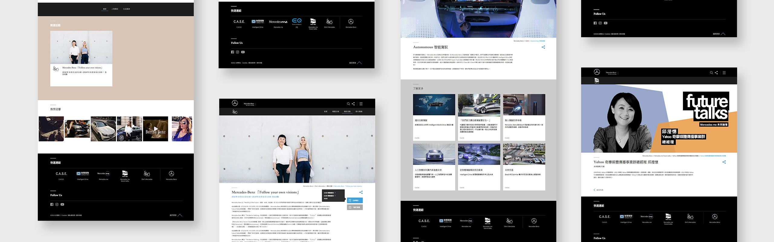
Key screen
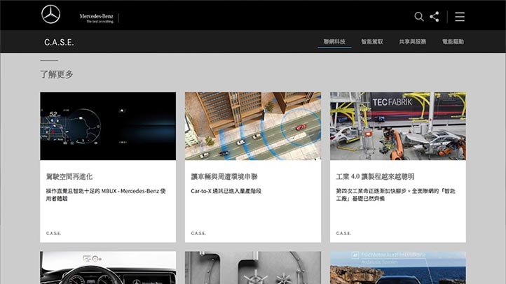
We put some main pages here, this is just a part of the whole website picture, you can understand the whole huge workload.
Related cases

Related cases
The First Insurance
Employee platform

Related cases
Lattice Bond Trading Platform
 EN
EN  TW
TW