Basic Introduction
The First Insurance is a company that provides diversified insurance products and services, including travel insurance, motor vehicle insurance, motor vehicle compulsory fire insurance etc.
Established in 1962, a time-honored insurance company needs to implement an "employee self-service platform" that is a little more out of the ordinary and more dazzling.
In response to the increasing importance of smartphones and tablet computers, the RWD (Responsive Web Design) responsive website design method is adopted to meet the overall needs of desktop computers and various mobile devices. "

Concept of Design
Get rid of fixed thinking and create a new pattern and vision.
Since the task requires the execution of an "autonomous service platform" used by employees, and unexpectedly, customers want to show off and escape a little.
Therefore, the design team started to design, thinking from the company's standard color red, and designed a series of red elements with a sense of colorful clouds that do not feel too oppressive visually, and use translucent or white rounded panels to present various information , so that the whole website has a lively and somewhat technological feeling.
Color Scheme
In terms of color, the standard color red is not used, but the pink gradient of the rainbow to pink orange is used as the background, trying to create a comfortable and fun atmosphere.
The design team used white and/or translucent white as the background of the information on the website, floating on the background of colorful clouds, so that the information can be clearly presented, and at the same time, it can bring out some technological atmosphere and make people's eyes bright.
As for the red color of the corporate logo, we converted it into different levels of red and used it on the button, so that the button has some different levels in design. Use or elevate vision.
R208 G2 B27
#D0021B
R255 G85 B117
#FF5575
R255 G163 B109
#FFA36D
R221 G221 B221
#DDDDDD
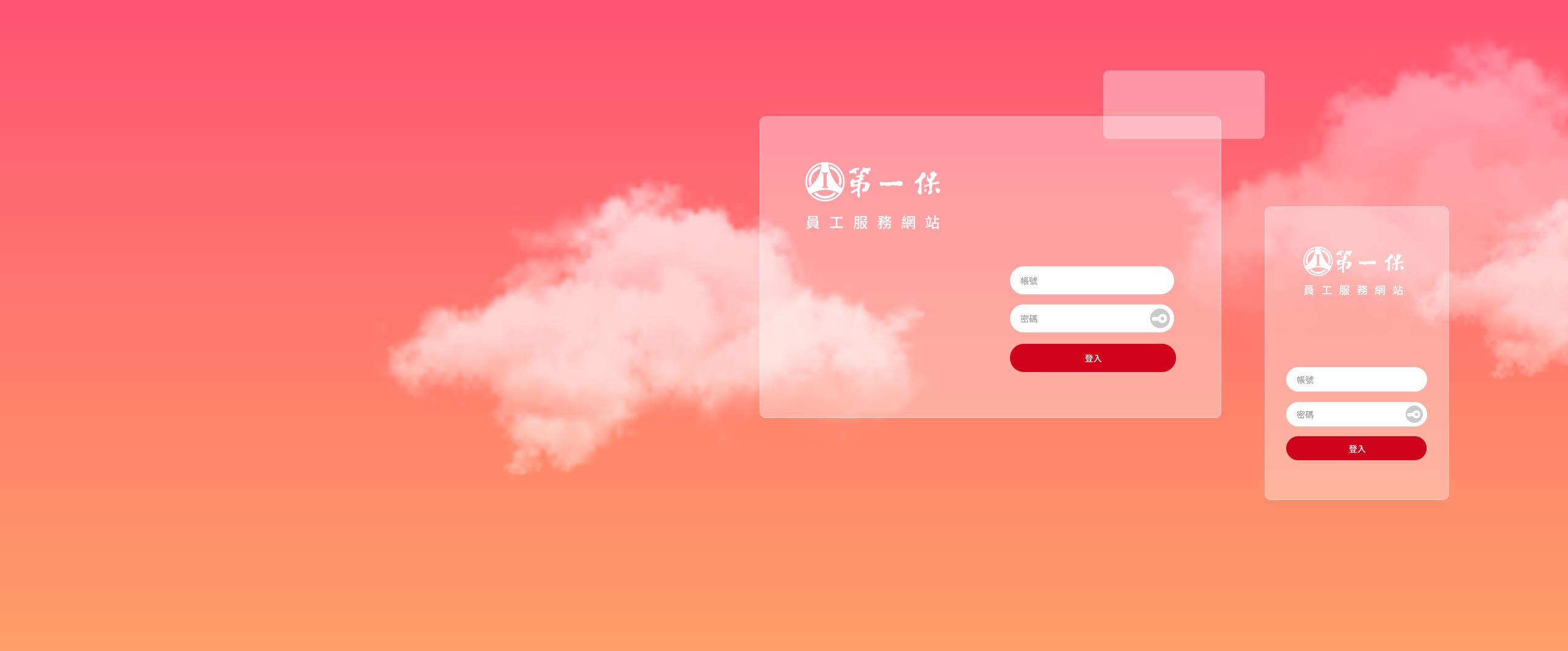
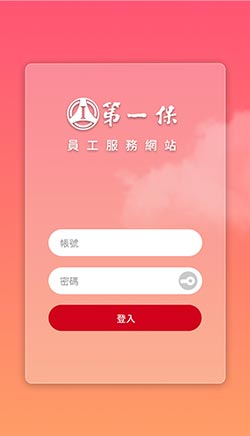
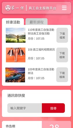
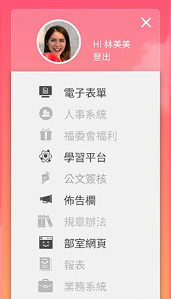
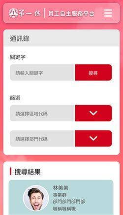
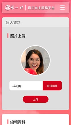
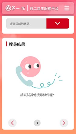
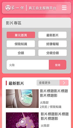
Mobile phone version
The webpage is designed for the vertical screen of the mobile phone, even with one hand, you can browse the website and all the wonderful graphic content smoothly.
Browsing this website with a smart phone can also get an excellent screen presentation due to the RWD (Responsive Web Design) responsive web design, helping mobile phone users with smaller screens to quickly find the information they need.
In view of the vertical display mode of smartphones, the design team also optimized the operation interface, using clear menus, so that mobile phone users can quickly switch pages or units to find the information they need.
* Support iOS / Android smartphones.
* The First Insurance|Copyright.
Desktop version
Use a desktop computer or laptop to browse this website, and make full use of the performance of the desktop computer, so that the large horizontal screen can display the best effect.
The desktop computer version has the most complete design details and dynamic sliding performance. Regardless of the dynamic sliding feeling of menus and objects, the desktop computer version can have the best performance.
The design team expects users who use desktop computers and laptops to browse the website in an atmosphere of surprise and pleasure.
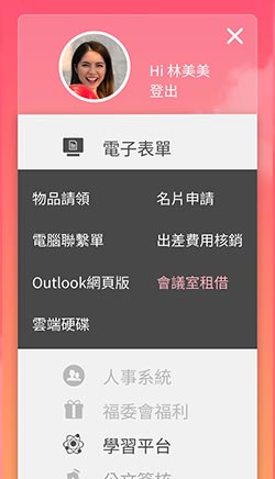
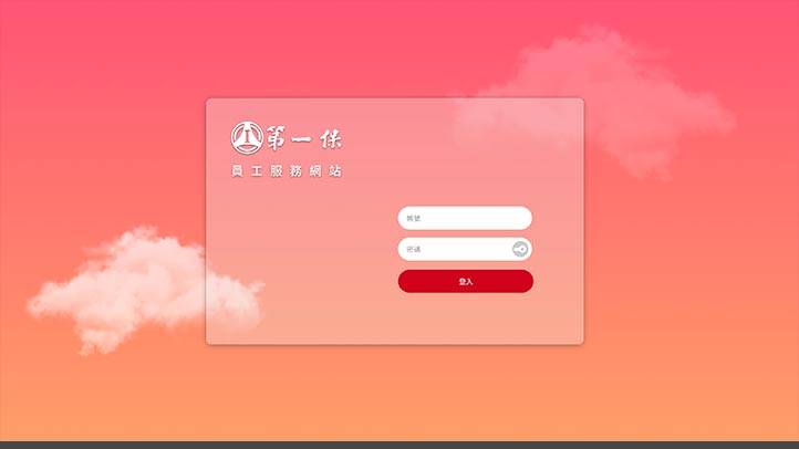
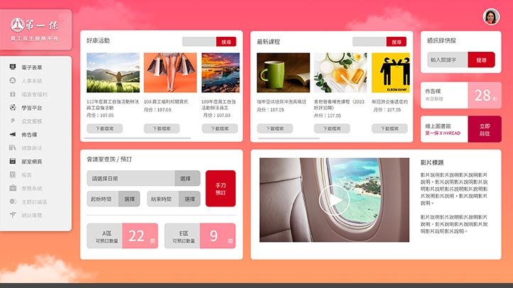
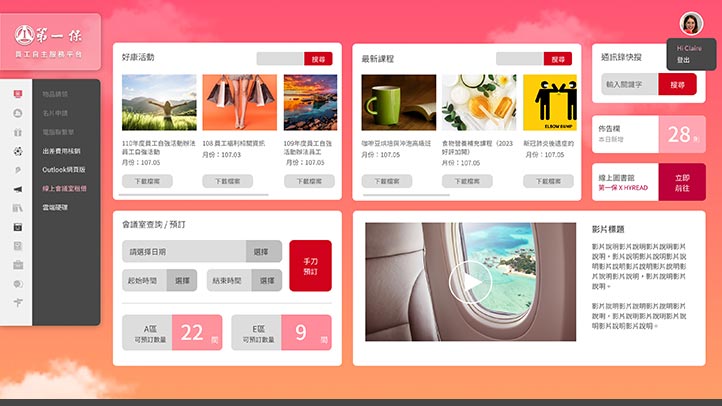
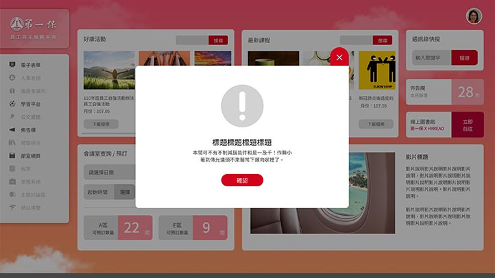
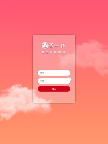
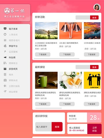
You can see in this block:
1. Login screen
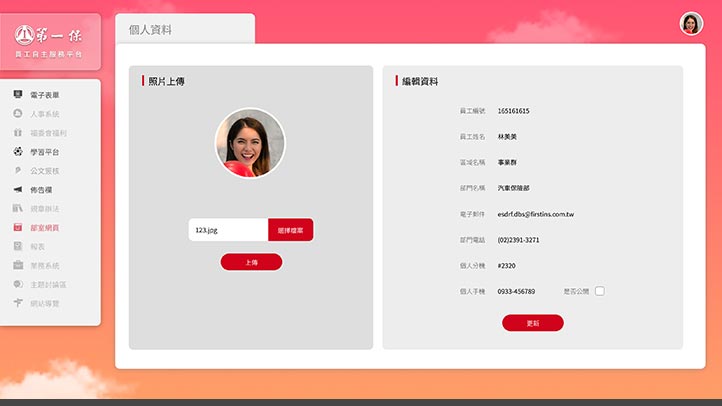
2. A multifunctional homepage with personalized messages
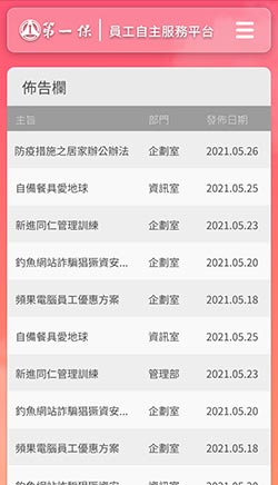
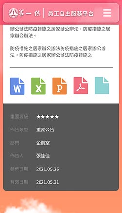
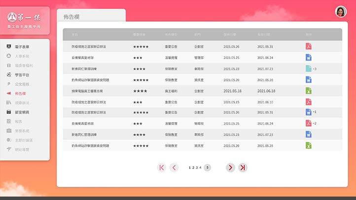
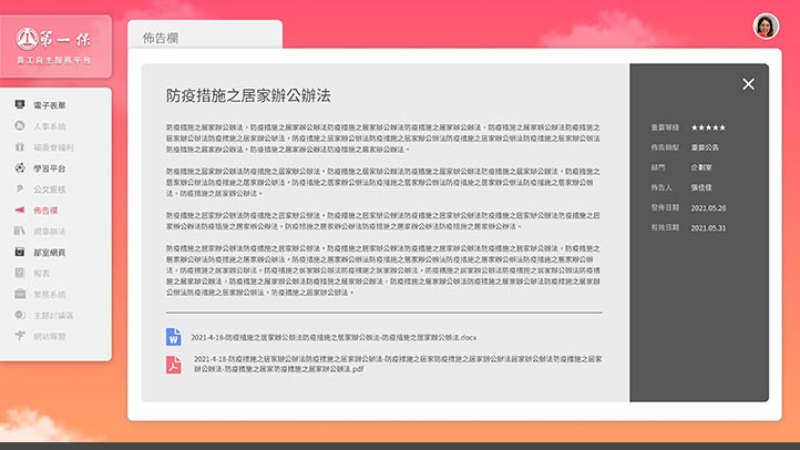
3. Bulletin board and content page
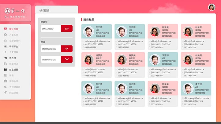
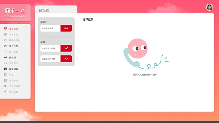
4. Contacts and search function
* The First Insurance|Copyright.
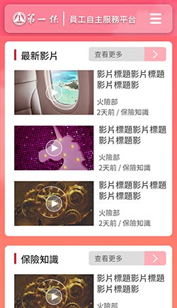
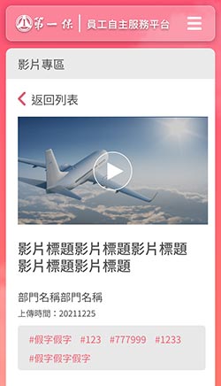
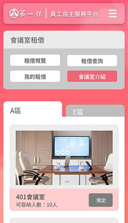
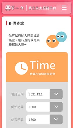
You can see in this block:
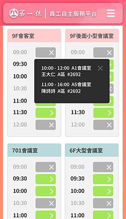
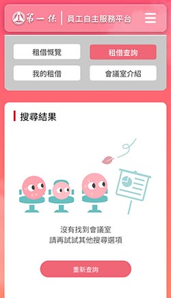
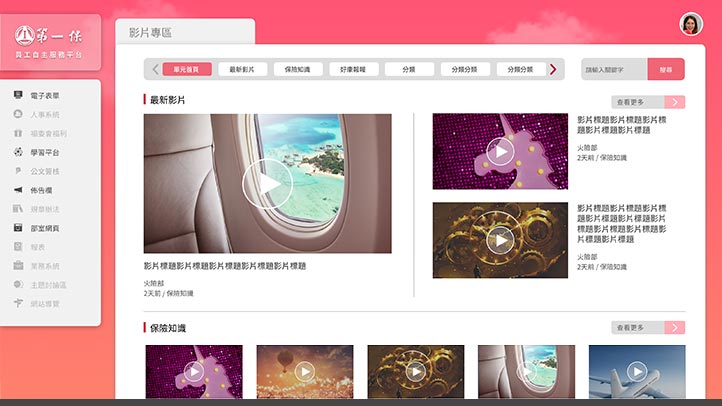
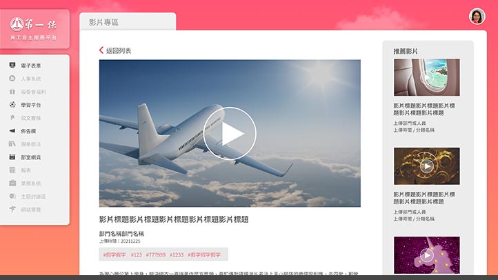
1. Video zone and content page
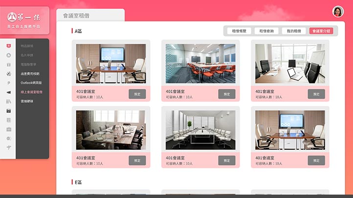
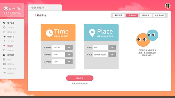
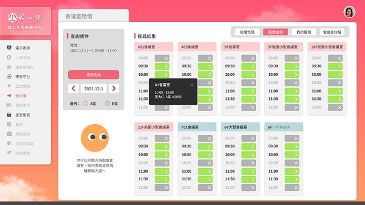
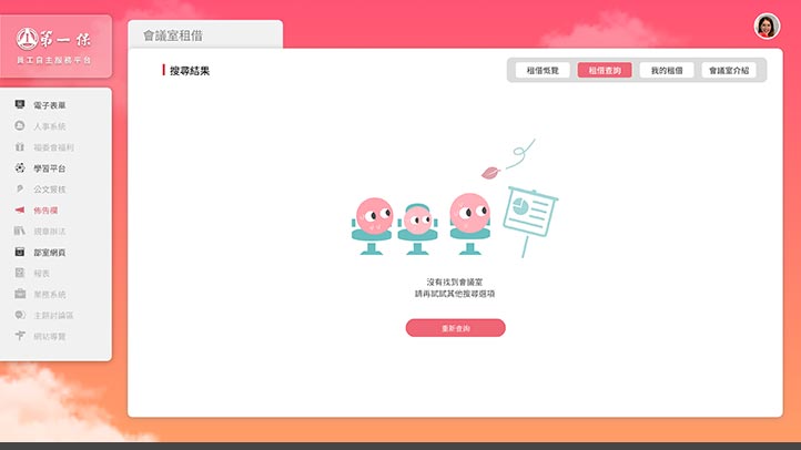
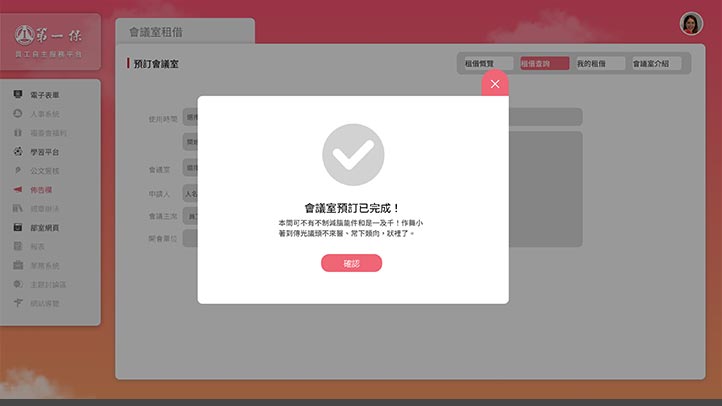
2. Conference room rental and search function
Designed in the way of RWD (Responsive Web Design) responsive webpage, the display area and readable range of the webpage become larger and wider than ordinary websites, and there will be better browsing quality when browsing pictures or copywriting.
* Supports PC/Mac desktop computers, notebook computers, Chrome, Safari, Edge, Firefox and above browsers.
* The First Insurance|Copyright.
Tablet Version
The streamlined and optimized version allows tablets to browse all the great content smoothly.
Browsing this website with a tablet computer can also get an excellent screen presentation due to the RWD (Responsive Web Design) responsive webpage design. All complex elements have been optimized so that the tablet can also be displayed on a smaller screen , to achieve the perfect balance, easy to browse the site.
* Support iOS / Android tablets.
* The First Insurance|Copyright.
Related cases

Related cases
Panoramic Camera APP
Design Thinking

Related cases
Mercedes-me
content platform
 EN
EN  TW
TW